Have you ever been on a website without a CTA, wondering what you’re supposed to be doing next? Yes, it’s a bad idea to confuse your customers, leaving them to figure things out on their own. We assure you that most won’t be happy to dig around and will hop onto their next choice in no time.
To avoid that scenario, don’t neglect the use of CTAs. They’re what makes your audience pause, ponder, and, most importantly, take action.
But you shouldn’t just put one in the upper right corner of your site and call it a day. We’ve all seen those CTA buttons that just don’t click, figuratively and literally. They’re either too vague, too pushy, or just lost in the sea of digital content.
That’s where we step in. We’ll guide you through crafting CTA buttons that speak to your audience, buttons that are not just seen but felt. We’ll dive into a space where every click counts, and we’ll even throw in some exceptional examples to show you how it’s really done.
What Is a CTA Button?
Call to Action buttons are a vital part of every digital marketing strategy. They shine everywhere where action is desired. From e-commerce sites urging you to “Buy Now” to blogs inviting you to “Read More,” these buttons are the catalysts for action.
They’re the final nudge that transforms a passive browser into an active participant. Whether it’s signing up for newsletters, downloading a whitepaper, or making a purchase, the CTA button is your digital megaphone, calling out to potential customers and loyal clients alike.
It’s been proven that personalized CTAs can improve conversion rates by up to 202%. A HubSpot study found that tailoring the CTA to the user’s journey makes it far more effective.
HubSpot discovered another compelling characteristic of CTAs that are optimized with the right keywords. They reveal that such CTAs can boost business websites’ conversion rates by 87%. This is a testament to the CTA button’s potential to turn your website’s visitors into active contributors to your business’s growth.
Next, we’ll dive into seven best practices to ensure your CTA buttons are both present and powerful.
Accompanying Your CTAs with Visual Cues
We think of icons as decorative elements, but they’re so much more. These visual cues quickly and effectively communicate your message when placed alongside CTAs. They not only catch the eye but also provide an instant understanding of what to expect upon clicking.
The key to using icons effectively is to choose symbols that directly relate to the action or service. For instance, a shopping cart icon is universally recognized and immediately associated with making a purchase. This direct connection between the icon and the action it represents minimizes confusion and streamlines the user’s journey on your site.
It’s also crucial to ensure that the icons you use are universally understood. While creativity is valuable, clarity is paramount. Icons should transcend language barriers and be immediately recognizable to your audience, regardless of their background. This approach ensures that your message is conveyed quickly and effectively, leading to a higher likelihood of user engagement.
A shining example of this tactic done right is Lanteria, an HR management system. Their CTA, labeled “Product Tour,” could easily have been another vague invitation. However, Lanteria went a step further by adding a play icon to the CTA.
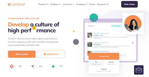
This small addition transformed the button, making it clear to customers that they’re about to embark on a video journey, exploring the platform’s features.
This specific and straightforward approach stands out in a sea of generic “See Here” or “Learn More” buttons. It tells prospects exactly what they’ll get by clicking on it – a guided video tour of the product.
Maximizing Engagement with Descriptive Text Labels
When it comes to CTAs, clarity is king. Full descriptions play a key role in guiding user engagement by offering clear, concise instructions on what lies ahead. These labels act like signposts, directing traffic on the information highway of your website. The right words can illuminate the path for your users, encouraging them to take the desired action without second-guessing.
The effectiveness of a CTA largely depends on how well it communicates. Crafting text labels that are specific and guide the user on what to expect is crucial. Instead of vague prompts like “Click Here,” opt for more descriptive phrases that tell users exactly what they will get or do. This specificity enhances user experience and aligns with their expectations, leading to a more seamless interaction.
Incorporating relevant words and queries into your CTA text can significantly impact its effectiveness. This approach ensures that your CTAs are compelling and resonate with your audience’s needs and interests. By using language that mirrors your users’ queries or reflects their needs, you create a sense of familiarity and relevance, which can be a strong motivator for taking action.
A prime example of this strategy in action is eTraining, a company specializing in online workplace safety training. Their CTA, “What Type Of Safety Training Do You Need?” is a masterclass in engagement. Instead of a less-descriptive “Get Started,” this CTA poses a direct question that immediately engages the user.
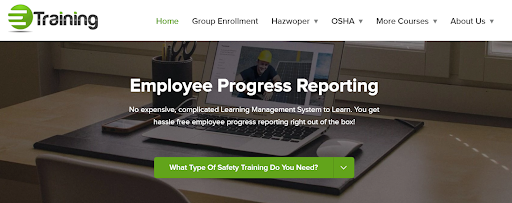
Upon interaction, it opens a drop-down menu offering choices directly related to the question asked. It’s a move that’s brilliant in its simplicity and effectiveness. It captures the user’s attention and leads them directly into a personalized interaction, making their journey on the site more engaging and relevant to their specific needs.
Personalizing CTAs with a First-Person Approach
There’s a huge difference between a general call and a personal invitation. Using first-person language in your CTAs can create a more intimate, direct connection with your audience. It’s a move that makes the user feel like they’re being spoken to directly, fostering a sense of involvement and personal relevance.
The first step in employing this technique is to use language that speaks directly to the user. Phrases like “Start My Free Trial” or “Simplify My Day” create a sense of ownership and immediacy. This personalized approach can be more effective than a generic “Begin Free Trial” or “Download Template” because it places the user at the center of the action, making the CTA feel like a bespoke invitation.
A standout example of this strategy in action is Dress Forms USA, a professional dress forms seller catering to a B2B clientele. Understanding that their client base highly values market opinions, they focus significantly on showcasing customer reviews. However, instead of a plain “Reviews” button, they chose a more personalized approach.
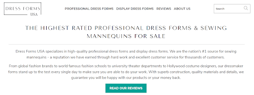
Their homepage features a CTA that directly addresses the visitor – “Read Our Reviews.” This phrasing does wonders. It invites potential customers into a shared space of trust and credibility, where they can hear from others who’ve walked the same path.
It’s a CTA that’s not only a button but a gateway to a community of satisfied customers, making it far more compelling than a bland, impersonal alternative.
Driving Action with Verb-Driven CTAs
In times when every second counts, the words you choose for your CTA can mean the difference between a user’s reluctance and decisive action. Verb-driven CTAs are a potent tool in this regard. They pack a punch, providing clear and compelling instructions that motivate users to take immediate action.
When crafting this type of CTA, it’s essential to choose verbs that clearly indicate the action you want the user to take. This clarity is crucial in guiding the user effortlessly towards the next step. Verbs like “Download,” “Subscribe,” “Buy,” or “Explore” leave no room for ambiguity, thereby reducing the cognitive load on the user and paving the way for a swift decision.
Moreover, the chosen verb should resonate with the service or product being offered. This alignment ensures that the CTA is a reinforcement of what the user can expect. For instance, “Join” might be more suitable for a community platform, while “Discover” could be ideal for an educational site.
Key One Realty Group, a real estate agency based in Dubai, knows how to leverage this tactic. On their homepage, they feature a search tool, inviting visitors to explore the properties they offer. The accompanying CTA, “Search Property,” is a model of clarity and directness.

This CTA effectively tells users exactly what action to take – to search for a property. It’s straightforward, action-oriented, and perfectly aligned with the service provided.
By choosing the verb “Search,” the company directly appeals to the user’s intent, encouraging immediate interaction with their platform. It’s a simple yet powerful CTA that cuts through the clutter and drives user engagement.
Utilizing Color Psychology in CTA Design
Colors do more than just decorate – they communicate. This is particularly true for CTAs, where the psychology of color is key in influencing user behavior and decision-making. The right color choice can attract attention, convey a message, and significantly impact click-through rates.
One of the key strategies in leveraging color psychology is to select CTA colors that stand out against the website’s color scheme. This contrast is vital for visibility. A CTA that blends in too much with the background can easily be missed, while one that starkly contrasts will naturally draw the eye. The goal is to make the CTA pop without clashing with the overall design aesthetic.
Different colors evoke different emotions and psychological responses. For instance, blue often represents trust and security, making it a popular choice for finance and healthcare websites. Red, known for its urgency and energy, can be great for clearance sales or limited-time offers.
Understanding these emotional and psychological effects allows you to choose a color that aligns with the message and tone of your CTA.
Just take a look at Ultimate Meal Plans, a custom meal planner and grocery list app. This is a great example of a brand that skilfully plays with color psychology in its CTA design. Their signature color scheme prominently features green, symbolizing health and wellbeing. However, for their CTAs, they smartly opt for orange.
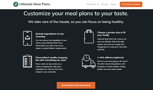
This choice is strategic on multiple levels. Firstly, orange, being a warm and vibrant color, contrasts well with green, ensuring that the CTAs are immediately noticeable.
Secondly, orange is often associated with food, appetite, and cooking, making it a fitting choice for a meal planning service. The color not only grabs attention but also subtly aligns with the service’s purpose, enhancing the overall user experience.
Enhancing the Focus on Your CTAs with Whitespace
When so many websites scream with information and visuals, minimalism and whitespace around CTAs can bring a breath of fresh air. While giving an aesthetic touch, this design approach is a strategic move that directs user focus and enhances the effectiveness of your CTA.
Whitespace, often referred to as negative space, is the empty space around and between elements of a webpage. In the context of CTAs, leveraging whitespace means creating a visual breathing room that draws the user’s eye directly to the button.
This space acts like a spotlight, highlighting the CTA and making it the focal point of the page. The absence of competing elements means there’s nothing to distract the user from the desired action.
The power of minimalism in CTA design lies in its ability to keep the user’s journey straightforward and distraction-free. A simple, clean design around the CTA minimizes cognitive overload and makes the user’s decision-making process smoother. It’s all about removing unnecessary frills and focusing on what truly matters.
Sales.co, a lead generation agency, perfectly executes this tactic. On their homepage, they feature a lime-colored CTA that immediately stands out. This CTA takes center stage, surrounded by ample whitespace, ensuring it’s the most prominent element on the page.
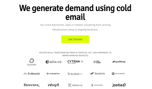
The rest of the elements, from the value proposition to the partners’ logos, are all in monochrome. This color scheme choice further enhances the CTA’s visibility, ensuring that the bright lime color doesn’t have to compete for attention.
The minimalist approach employed by Sales.co allows the CTA to be more noticeable while lending a sophisticated and modern look to their site, aligning with their professional image.
Creating Urgency and Scarcity in CTA Design
When it comes to digital marketing, creating a sense of urgency or scarcity is a powerful technique to motivate users to take swift action. This approach taps into a basic human instinct – the fear of missing out. By suggesting that an opportunity is limited, you can prompt users to act quickly to take advantage of it.
One effective way to drive urgency is through the use of countdown timers. These timers serve as a visual reminder of the limited time available to seize an offer. The ticking clock adds a dynamic element to the CTA, creating a sense of immediacy and prompting quicker decision-making.
The choice of words in your CTA can also play a significant role in creating urgency. Phrases like “Limited Time Offer,” “Exclusive Deal,” or “Only a Few Left” can trigger a psychological response, making the offer seem more valuable and time-sensitive. This language can nudge users towards taking action before the opportunity slips away.
Hostinger, an established web hosting provider, knows exactly how to play this game. Upon landing on their homepage, visitors are immediately greeted with a CTA that reads “Claim Deal.” In the overwhelming space of web hosting options, this CTA acts as a beacon, guiding customers swiftly toward a decision.
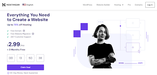
What amplifies the sense of urgency is the countdown timer placed just above the CTA, relentlessly ticking away the seconds and minutes the deal remains available.
This strategy effectively communicates that the deal is not just valuable but also time-sensitive, encouraging visitors to act fast.
Final Thoughts
In this article, we explored a range of techniques that serve a unique purpose in making your CTAs compelling enough to motivate action.
They all refer to different aspects of web design, but their goal remains the same: to guide your audience toward a desired action seamlessly and effectively. Incorporate them into your digital strategy to turn clicks into purchases.